Client: Rock/Creek — Industry:
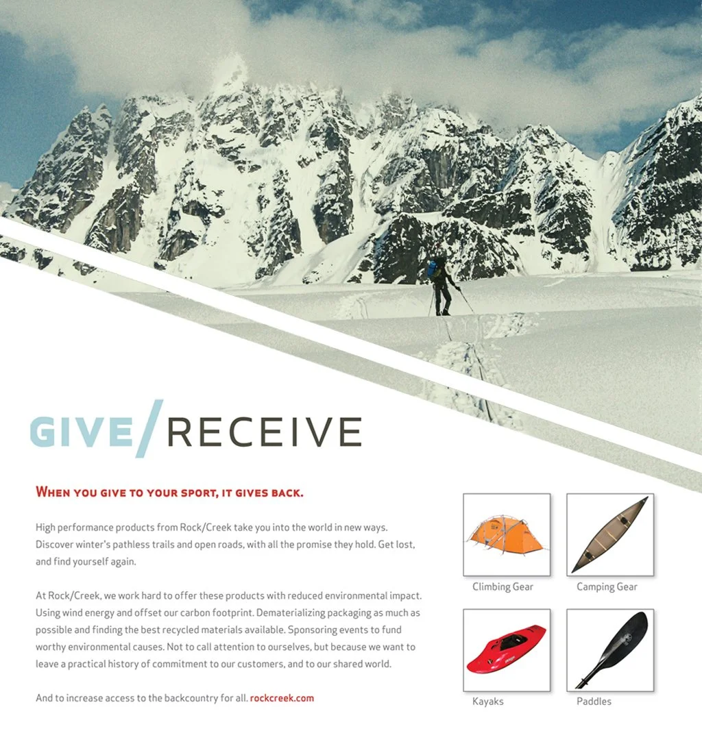
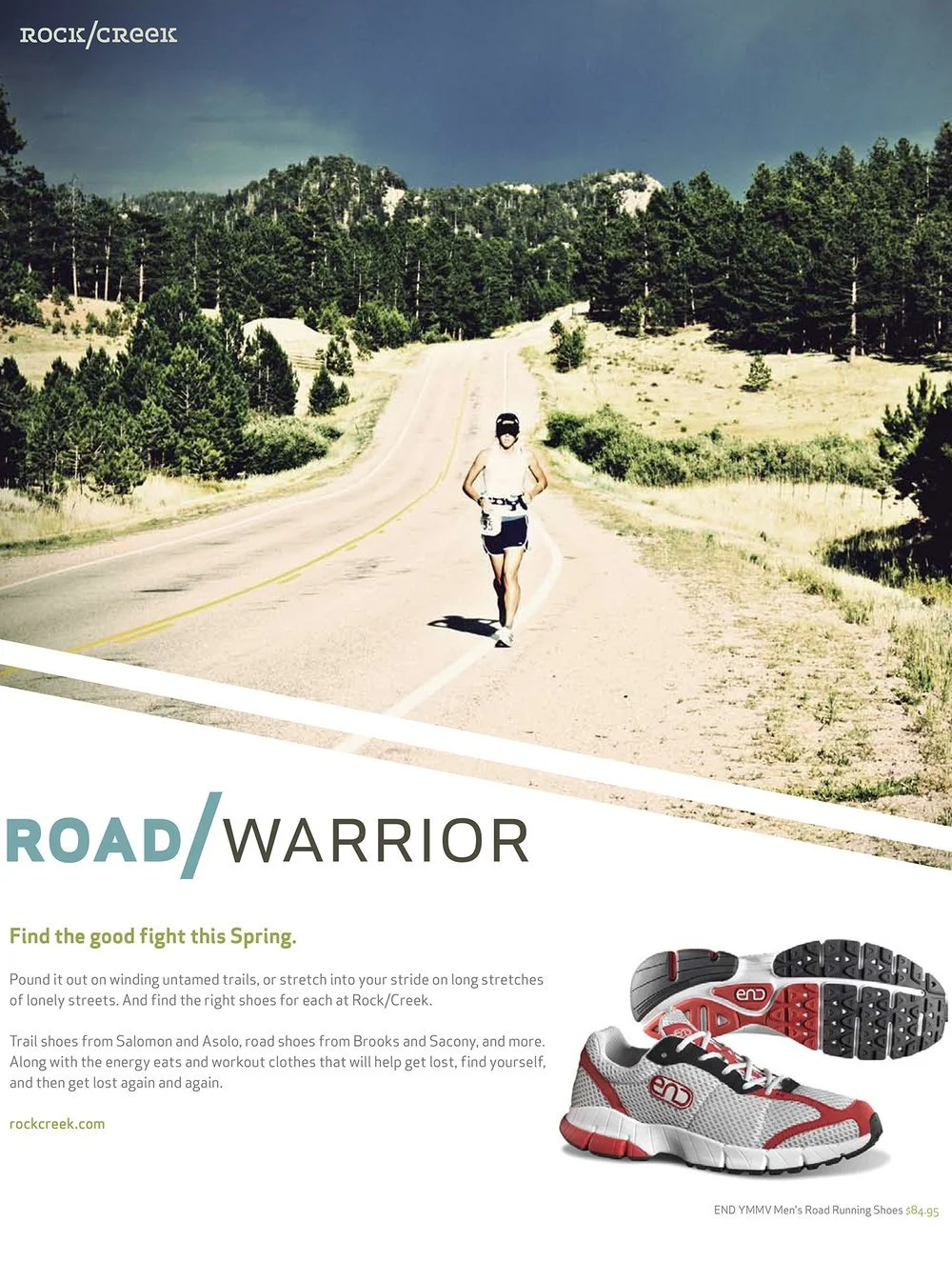
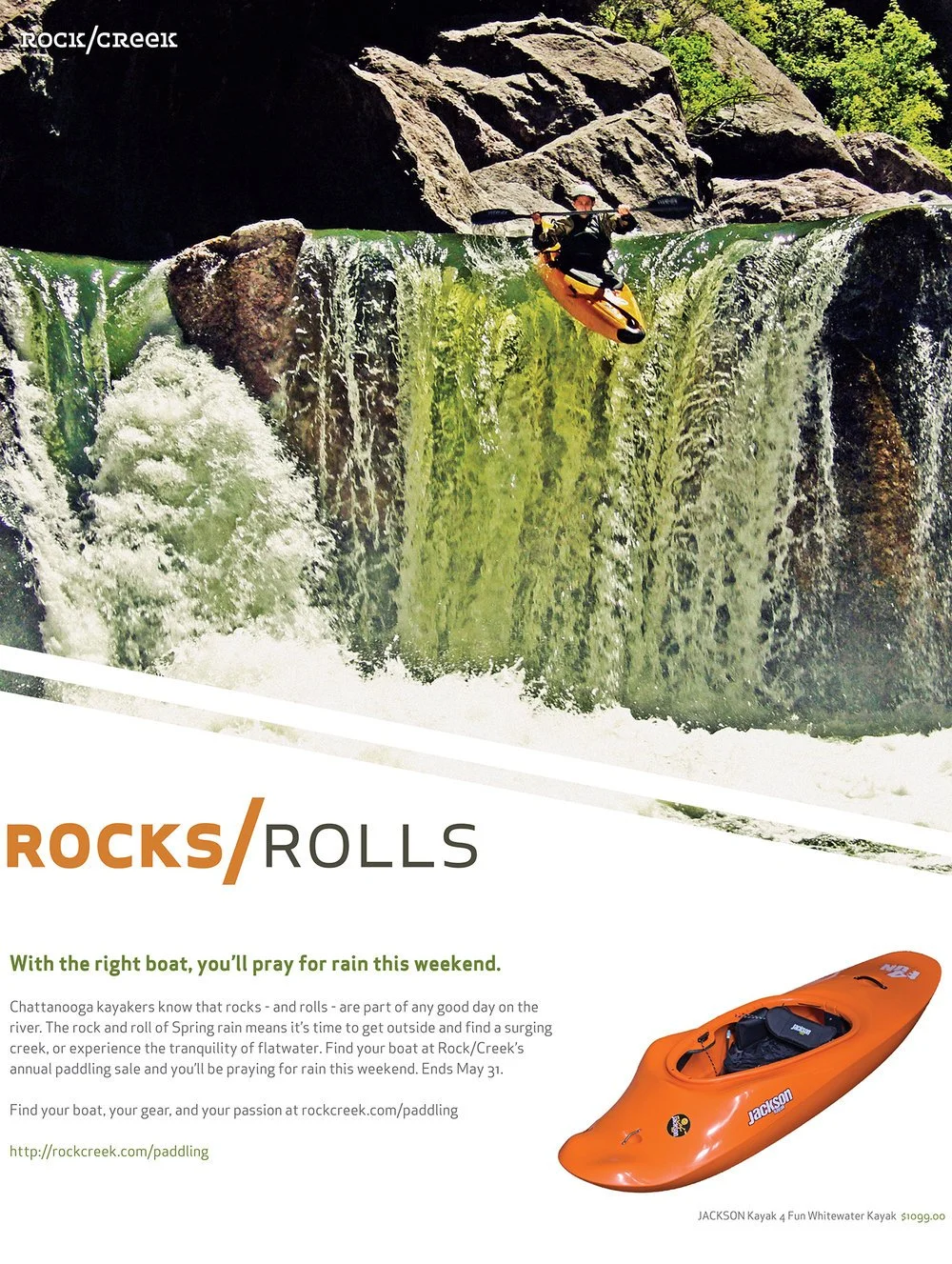
A 20 year old outdoor retailer wanted to rebrand, with a view to growing in–store and online sales. I could see that Rock/Creek’s strength comes not from the outdoor apparel and equipment they sell, but from the very human experiences that surround these products. So in crafting their brand voice, I wanted to highlight how they enhance the outdoor experience for customers of all skill levels.
So I created a highly conceptual, yet accessible “tagline engine. ” Built around the iconic slash in their logo, we paired positive words that, used together, bring new meaning.
I then applied this strategy not only to messaging, but to graphics, signage, packaging, web, and ads—then delivered the identity, as a usable tool kit, to Rock/Creek’s in-house marketing group. With Widgets & Stone.
“There simply are no other specialty retailers doing anything like this. Most
identities look like a watered-down imitations of major national brands. By
contrast, our brand is bold and forward-thinking. It is uniquely ‘Rock/Creek.’
The team’s method and the thoughtful nature of their work has reinvigorated
our own sense of direction and has given us a valuable focus for future
growth.”


