Client: Taiwan Economic Development Council — Industry:
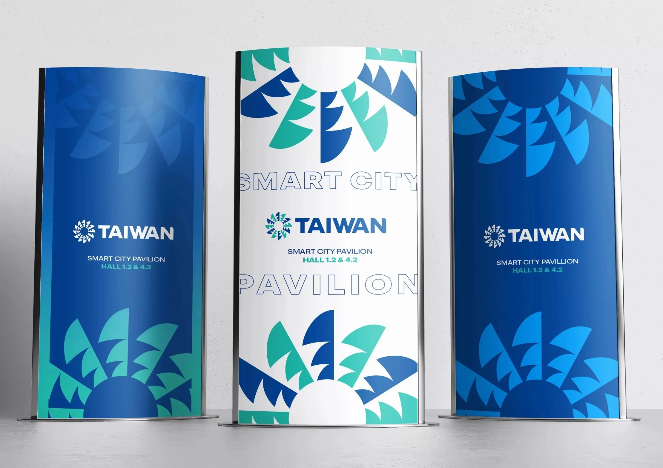
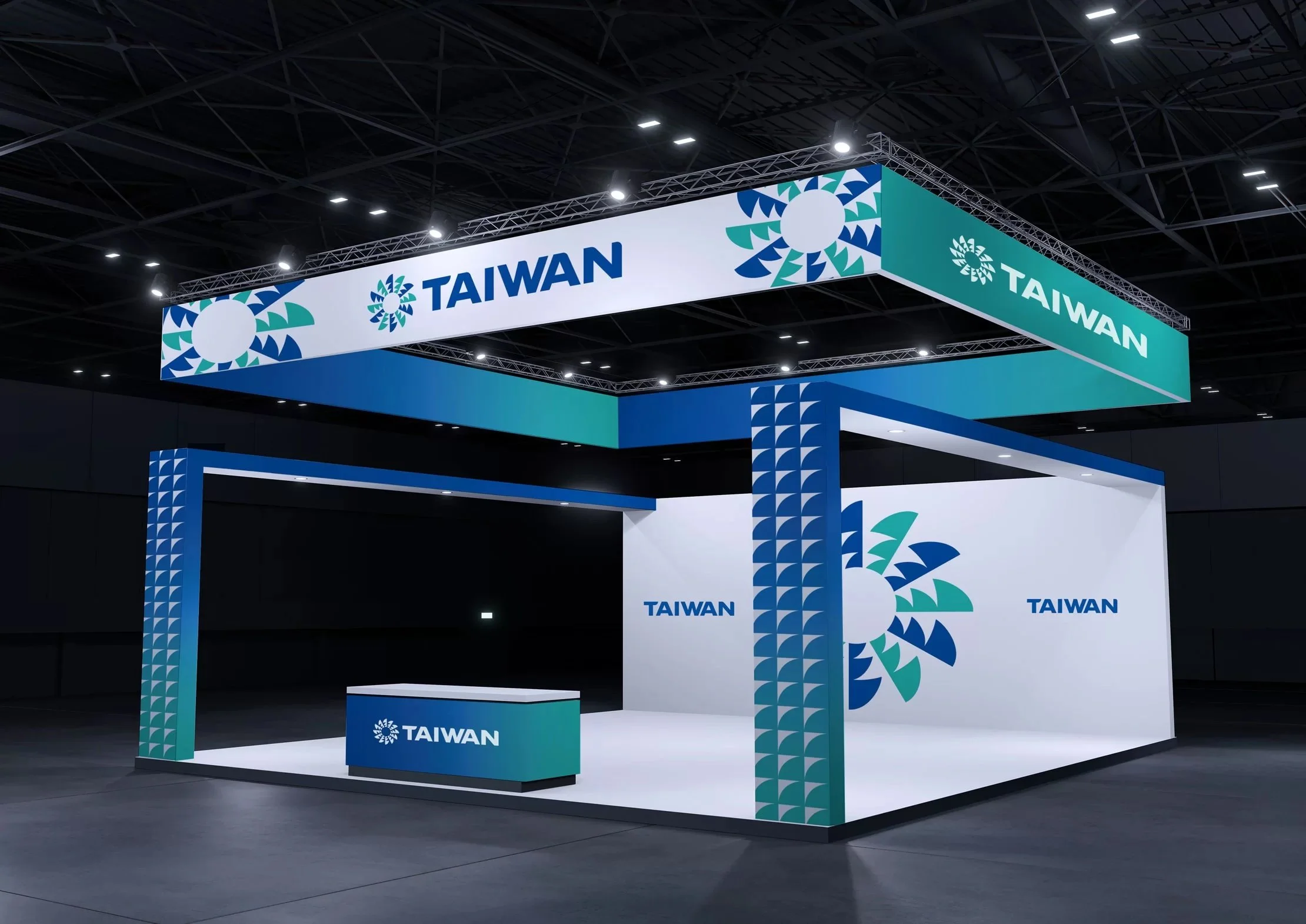
I was lucky to lead Brand Strategy for Taiwan’s Trade Development Council. Working with partner agency GreyBox, we reimagined the brand, replacing multiple identities that had been used across many channels into a single new identity designed to showcase the image and industrial advantages of Taiwanese enterprises at exhibitions worldwide.
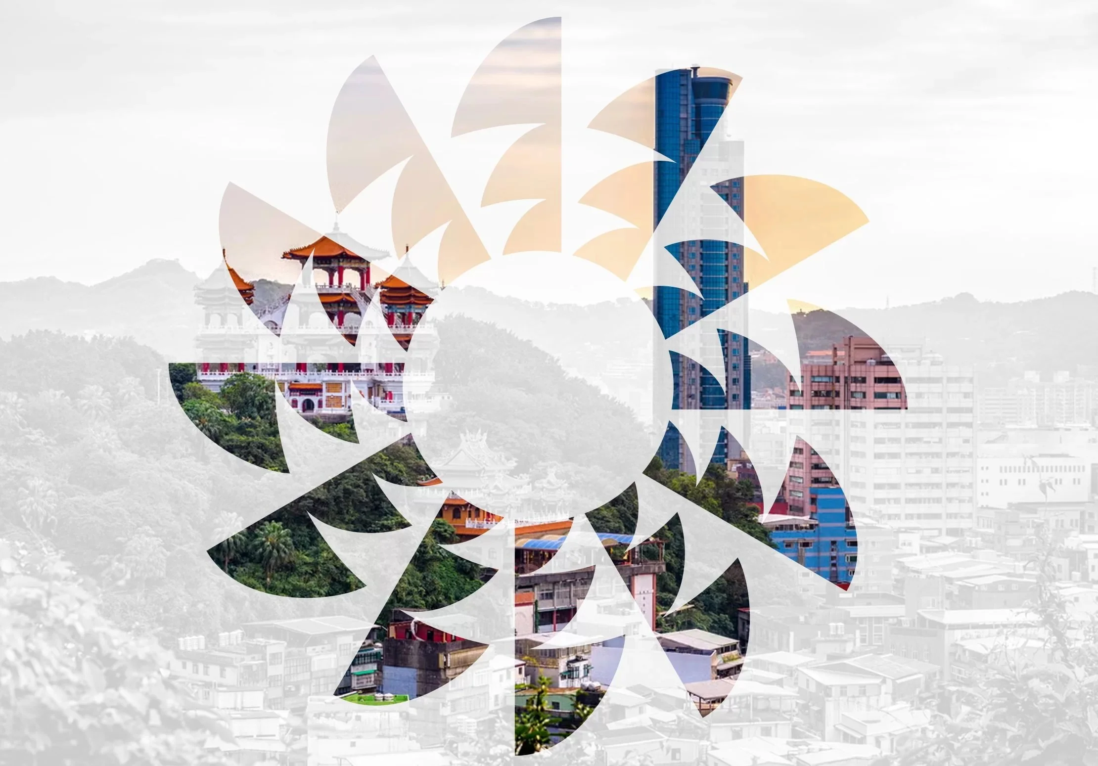
I held workshops with an international team based out of Bangkok and New York, developed values, vision, and shared motivations, and created briefs to guide visual design. The lovely, lively logo is inspired by the sun on the country’s flag, symbolizing the months of the year, traditional and modern constructs of time, and unceasing progress. With the talented design minds and hands at GreyBox Creative.


